


Dom
Brand Design
Web Design
Designing a digital library for the modern internet.
Dom started with a simple observation: people save things everywhere, but rarely have one place where those things become useful again.
Links stay open in browser tabs. Screenshots disappear into the camera roll. Recipes, products, quotes, memes, essays and ideas get scattered across apps, chats, notes and folders. The act of saving is easy. Finding something later, understanding why it mattered and turning it into a personal library is the harder part.
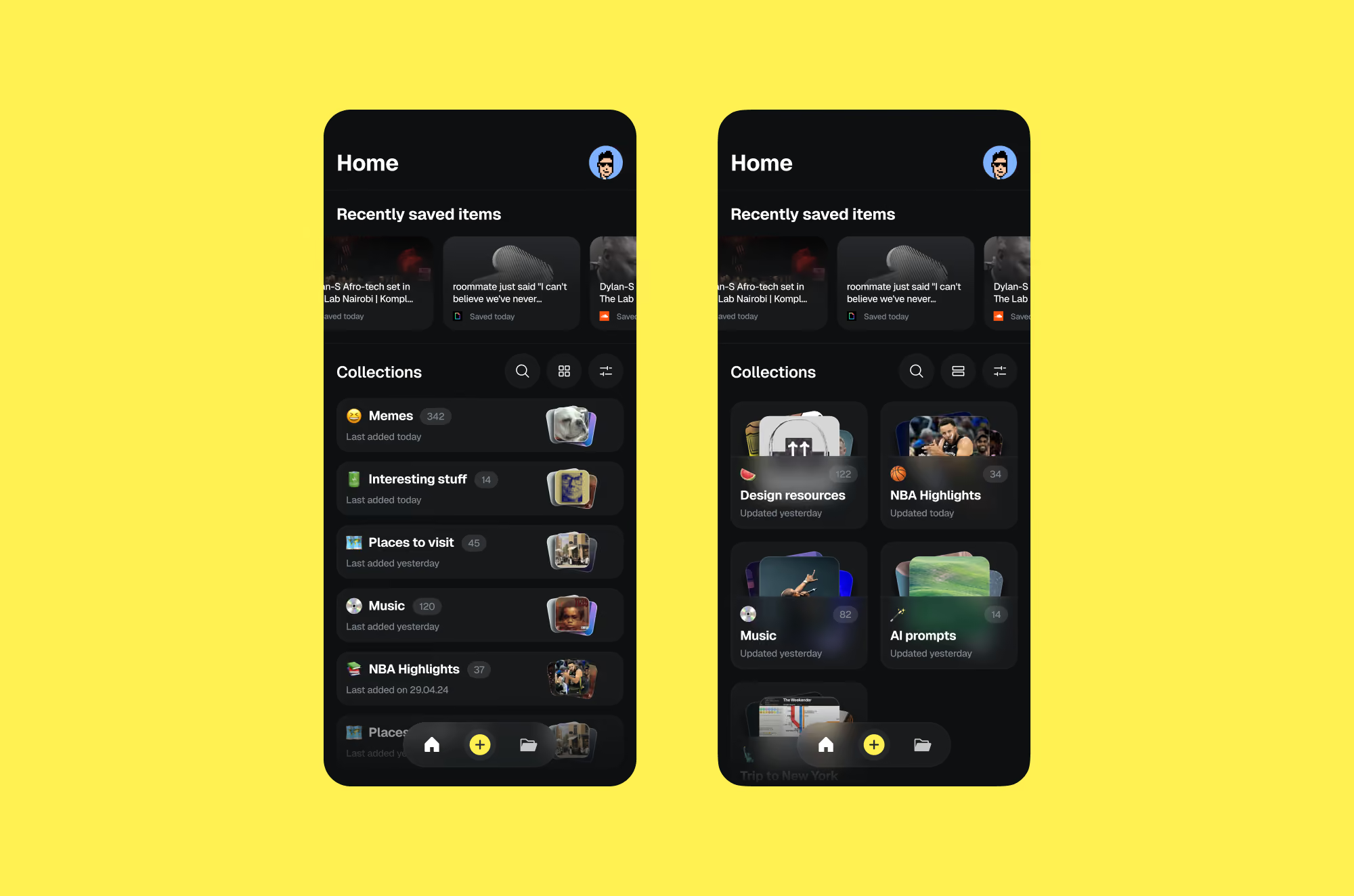
Dom set out to become a digital library for the internet — a place where people could collect, organize and return to the things they care about, regardless of format. Links, images, screenshots, quotes, articles, essays and visual references could all live together in one clear, searchable space.
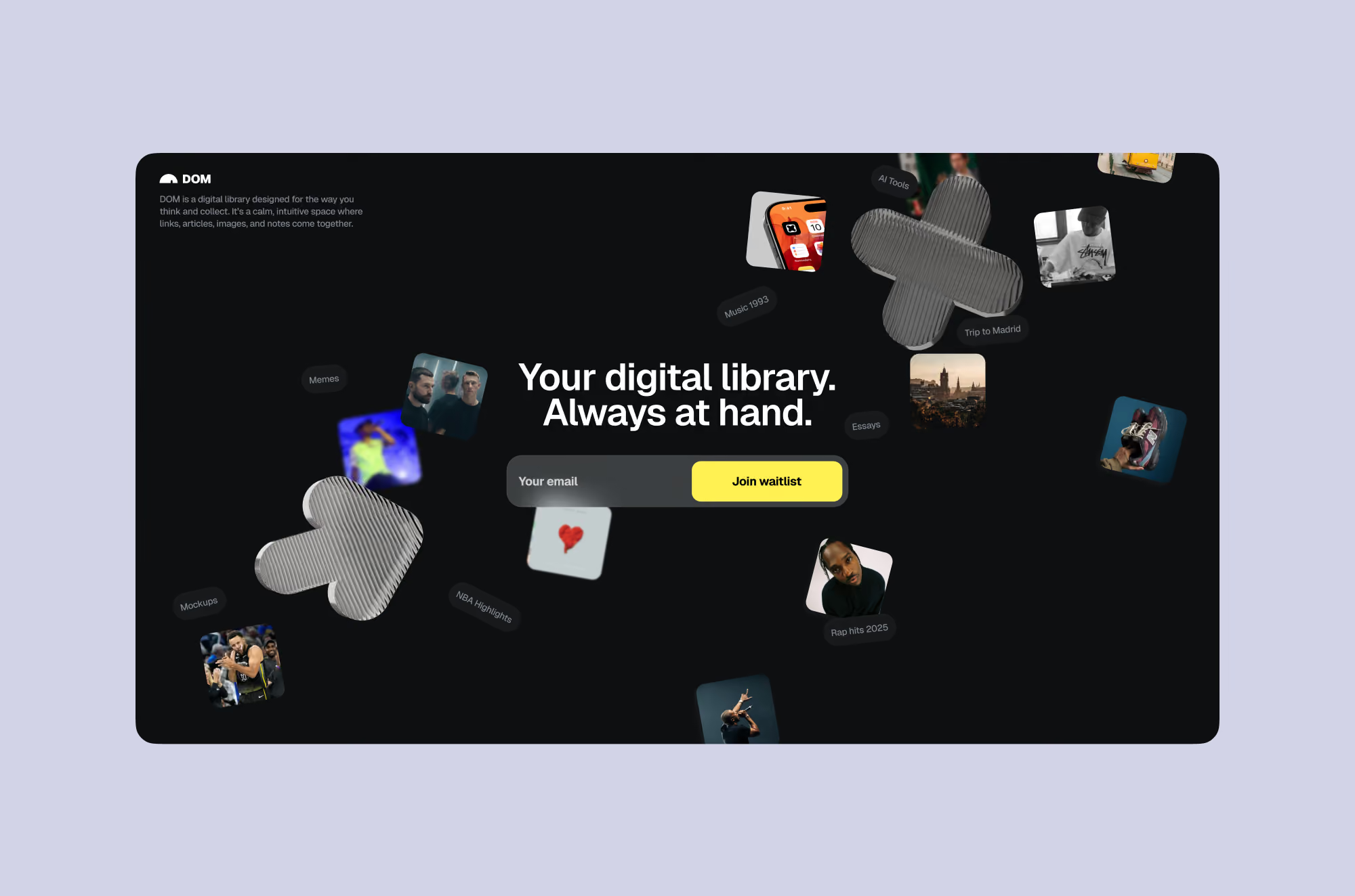
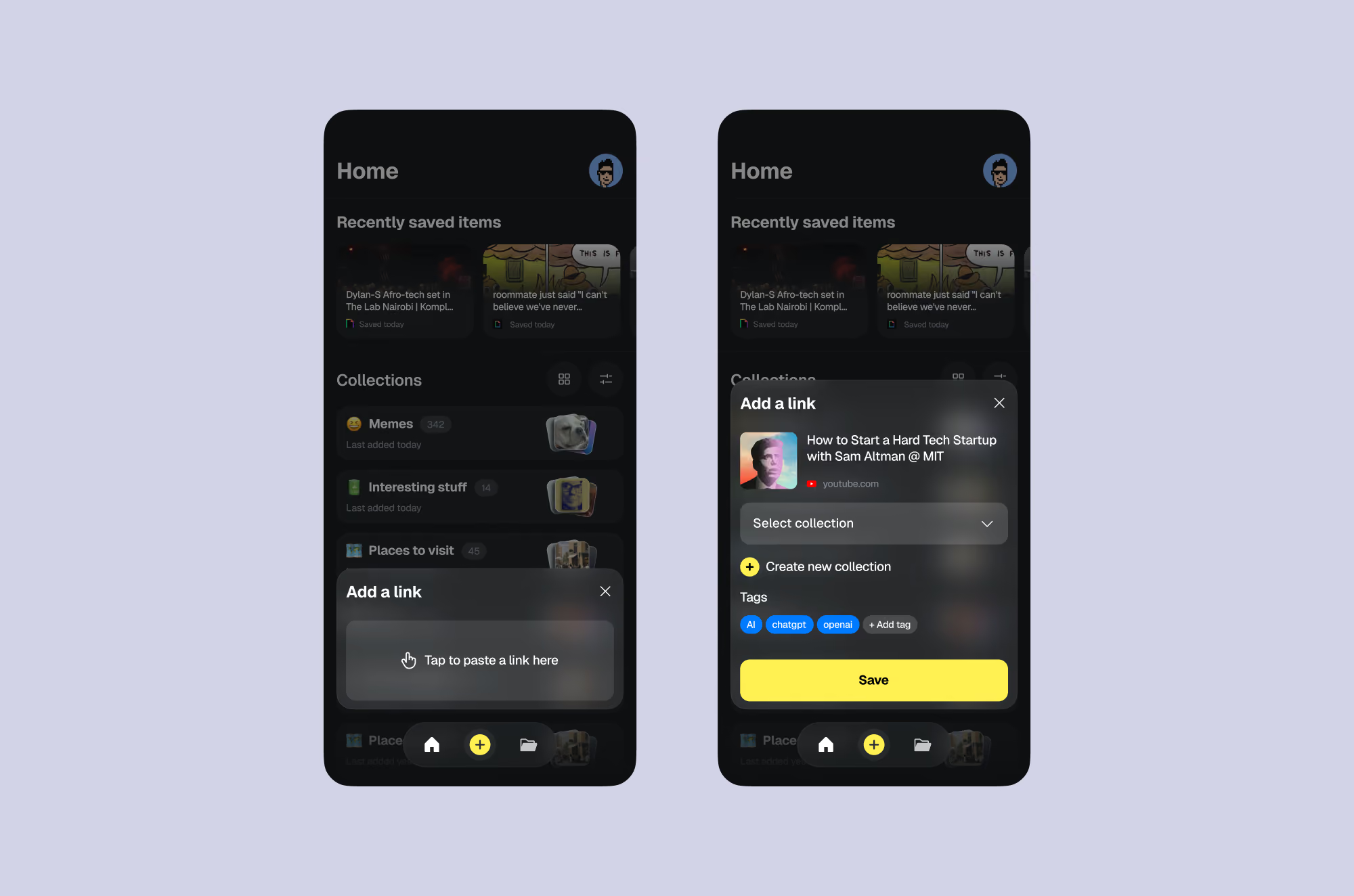
Turning scattered saves into AI-organized context.
As the sole designer, the role was to shape the product and brand from the ground up. That meant defining the visual identity, designing the full app experience and crafting every interaction around a core idea: saved content should feel organized without becoming another task to manage.
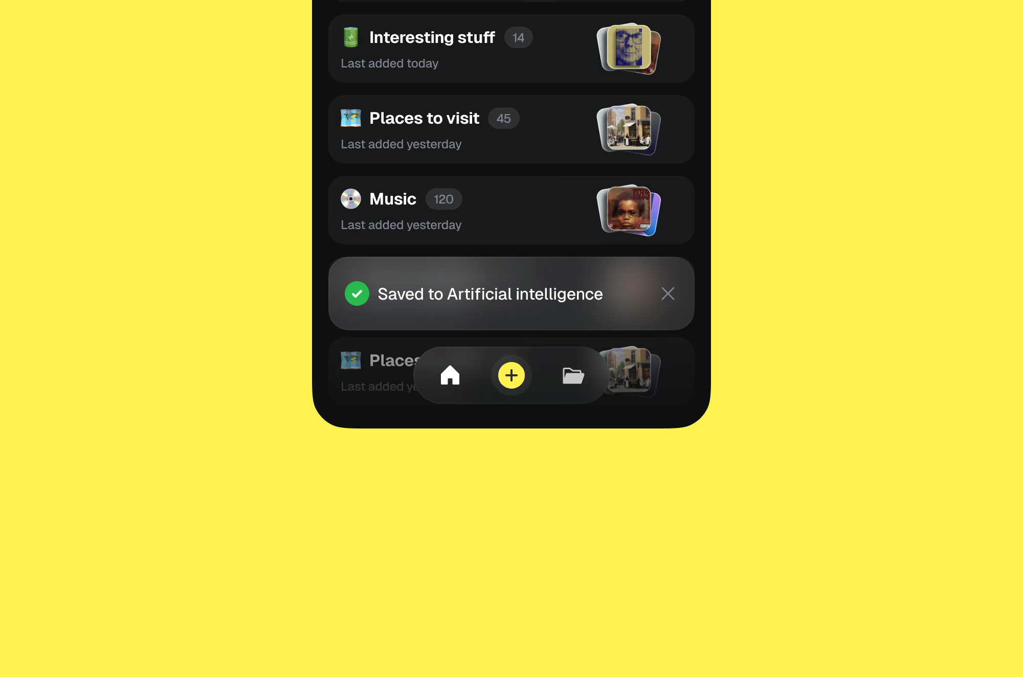
The design challenge was to make a powerful product feel calm, personal and effortless. Dom needed to support different kinds of content while keeping the experience simple enough for everyday use. Saving something had to feel instant. Organizing it had to feel light. Returning to it later had to feel intuitive.
A key part of the product experience was helping users bring meaning back to saved content. Dom was designed not just as a storage tool, but as a system that could understand what people saved. Once content was imported, the app could help identify the original source behind a screenshot. A visual reference, quote or article could become easier to trace, categorize and revisit.
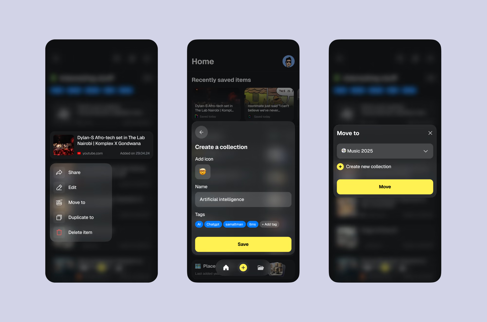
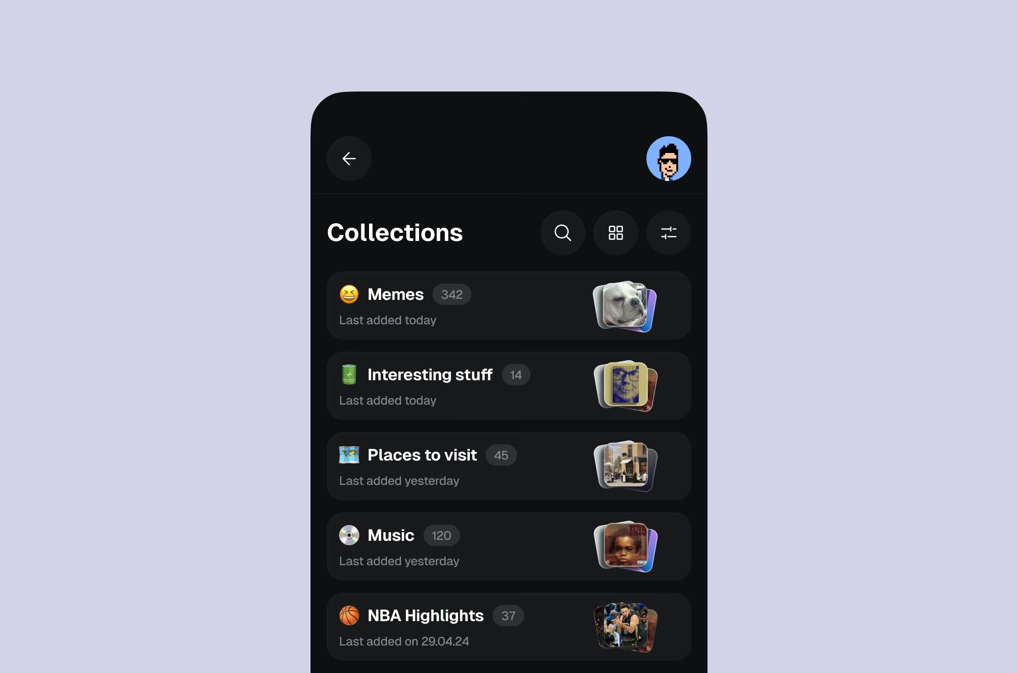
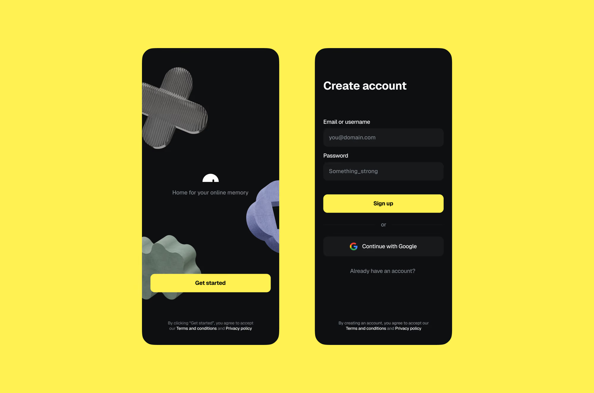
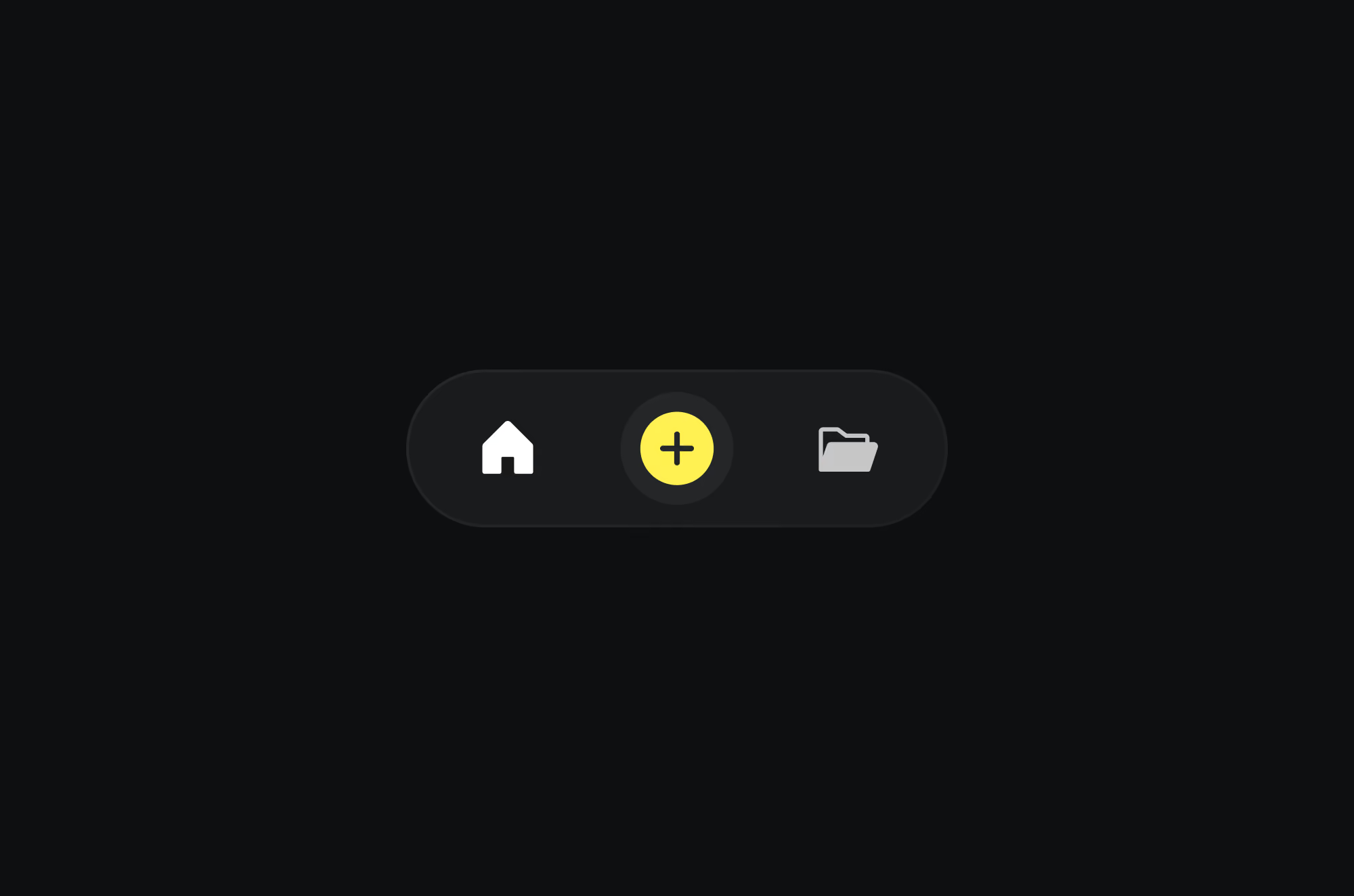
This intelligence shaped the interaction design throughout the app. The goal was not to overwhelm users with automation, but to make the product feel quietly helpful — reducing manual work, creating context and making saved items more useful over time.
The brand followed the same principle. Dom needed to feel like a place, not just a utility. The identity was designed to feel warm, personal and library-like, while still being modern and digital. It had to support a product that could hold everything from serious research to funny screenshots, from shopping ideas to long-form reading.
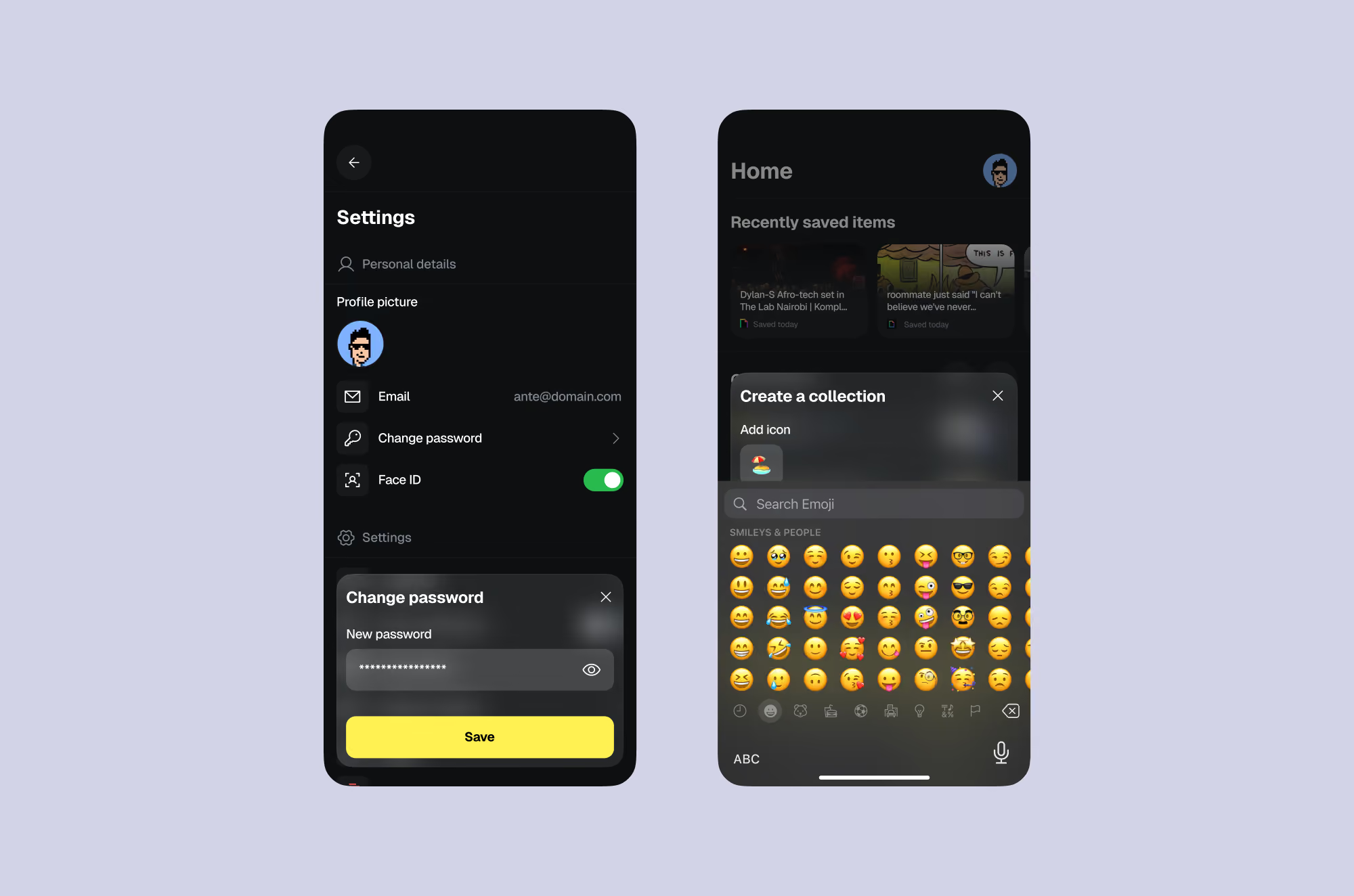
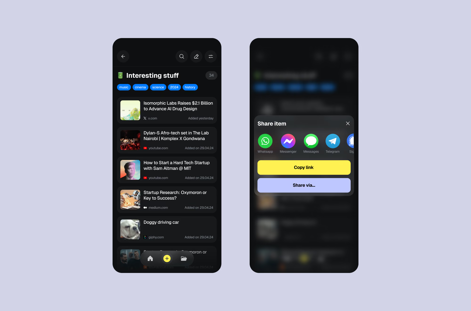
From onboarding and saving flows to organization, search, content previews and detailed item views, the product was designed as a connected system. Every interaction worked toward the same outcome: helping people build a digital home for the things they find, love and want to come back to.
The result was a complete brand and product foundation for a bookmarking app designed for the way people actually use the internet today — messy, visual, fast-moving and deeply personal.